
Let the Ink Decide - Drawing ink on wet paper
Drop ink on wet paper. Tilt slightly. Walk away. What comes back looks like something between a Rorschach test and a solar corona - and the ink did all of it on its own. These are five attempts at getting out of the way and letting the materials decide.
I dropped some ink on wet paper, tilted it slightly, and left it alone. That's the whole process. What came out looked like something a very dramatic scientist might frame and hang on a wall.
The technique has a name - wet-on-wet - and a long, respectable history. East Asian ink painters have worked this way for centuries, letting ink behave according to its own nature on a soaked surface. The Surrealists got there too: Max Ernst called his version decalcomania, pressing ink between surfaces and pulling them apart to reveal forms that no hand could have planned. The idea, shared across very different traditions, is that you set up conditions and then get out of the way.
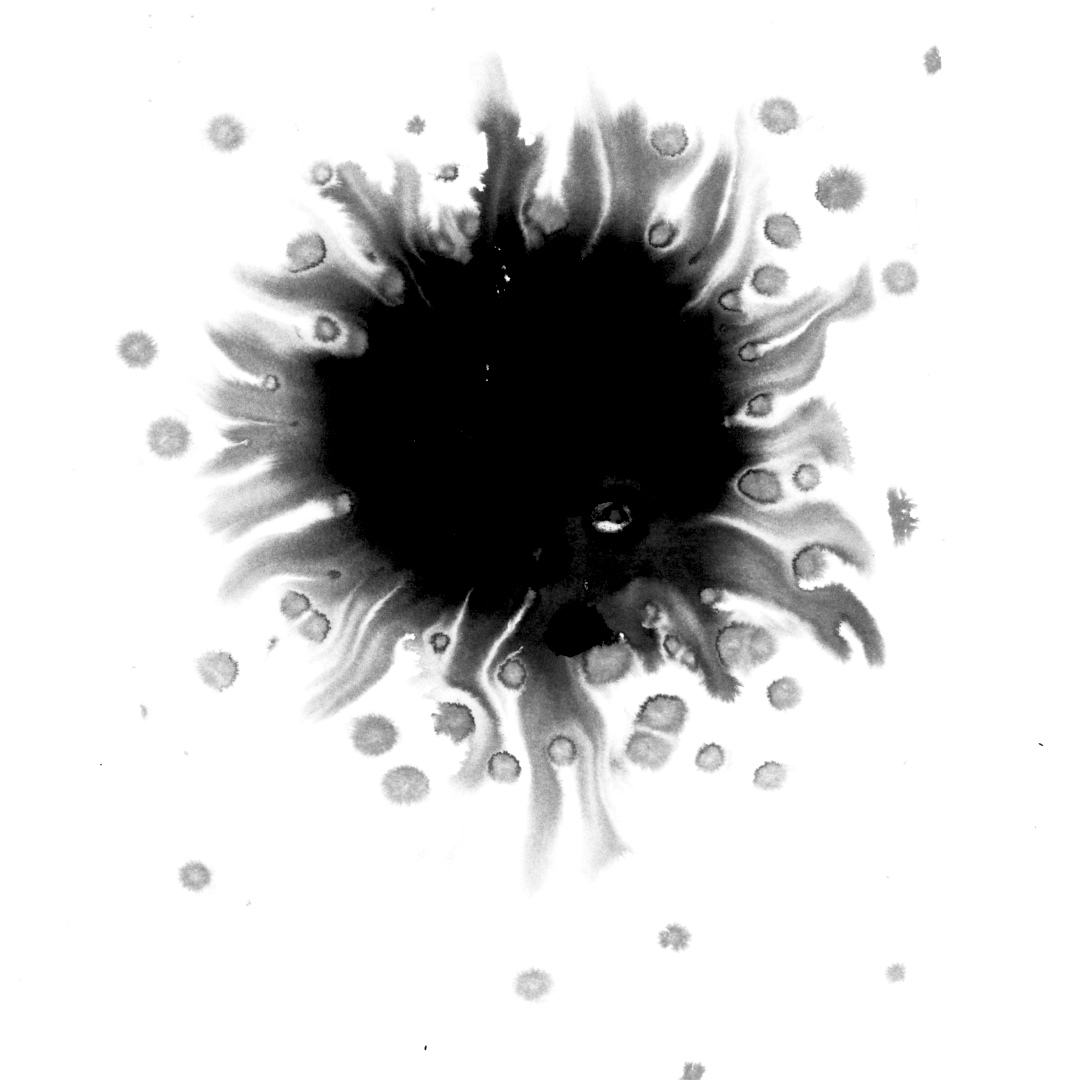
What you're looking at is drawing ink - pigmented, which matters. When pigmented ink hits wet paper, the heavier particles settle at the center while lighter ones get carried outward by the water. That's why each little satellite droplet has a pale halo around it. The ink is sorting itself by weight. It's doing chemistry, and it looks like a solar corona.
Hermann Rorschach had the same basic idea in 1921, though his ambitions were more clinical. He dropped ink, folded the paper, and asked people what they saw - then used their answers to map their inner lives. It didn't hold up as psychology, but as a concept it's hard to beat: an accidental shape that becomes a mirror.
I had a vague notion of using these images for something Rorschach-adjacent - a project, a series, something with that same quality of asking the viewer to read meaning into randomness. I haven't done it yet. But looking at them, I think the images are enough on their own.
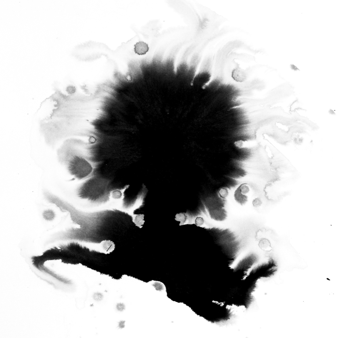
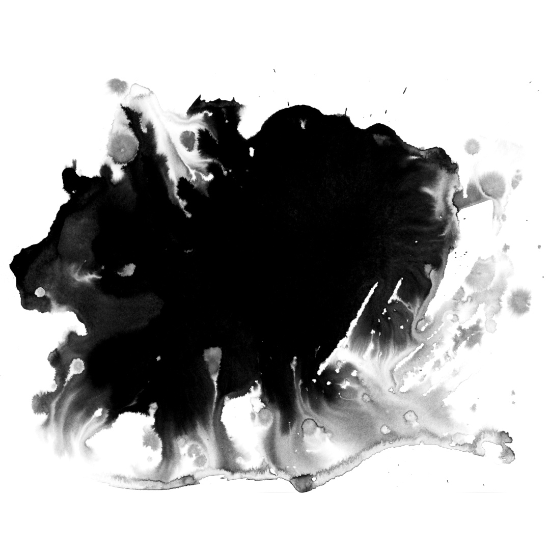
This one reads as a figure to me every time. The dense mass at the top, the ink sweeping down and outward like a cloak. I know it's just gravity and water pulling pigment across the page. It doesn't matter.
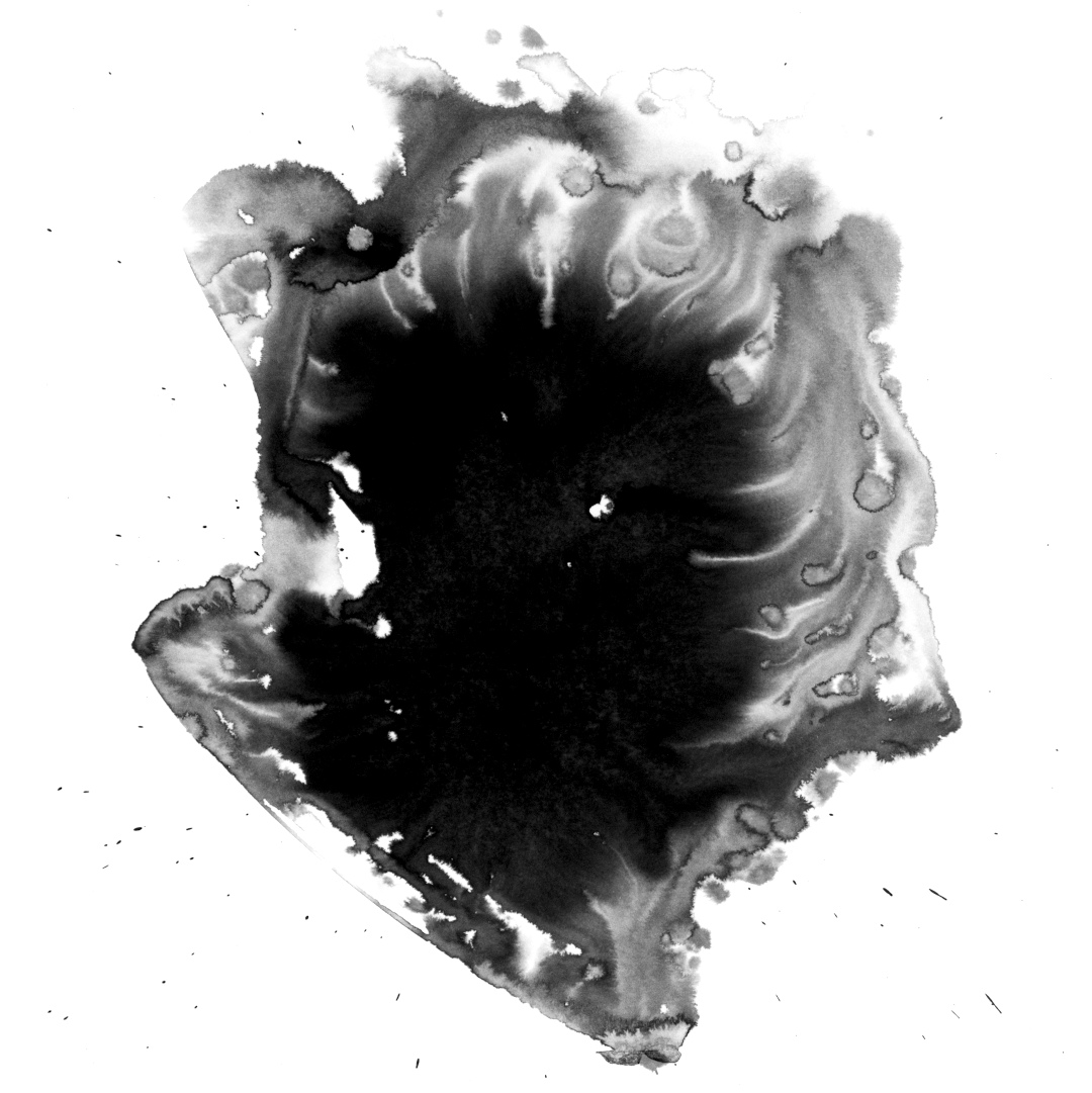
The interior of this one is the most complex - swirling grays, white gaps where the ink receded, an edge that looks like it was drawn by someone mapping a coastline. The others have a clear center and a clear periphery. This one is just turbulent all the way through.
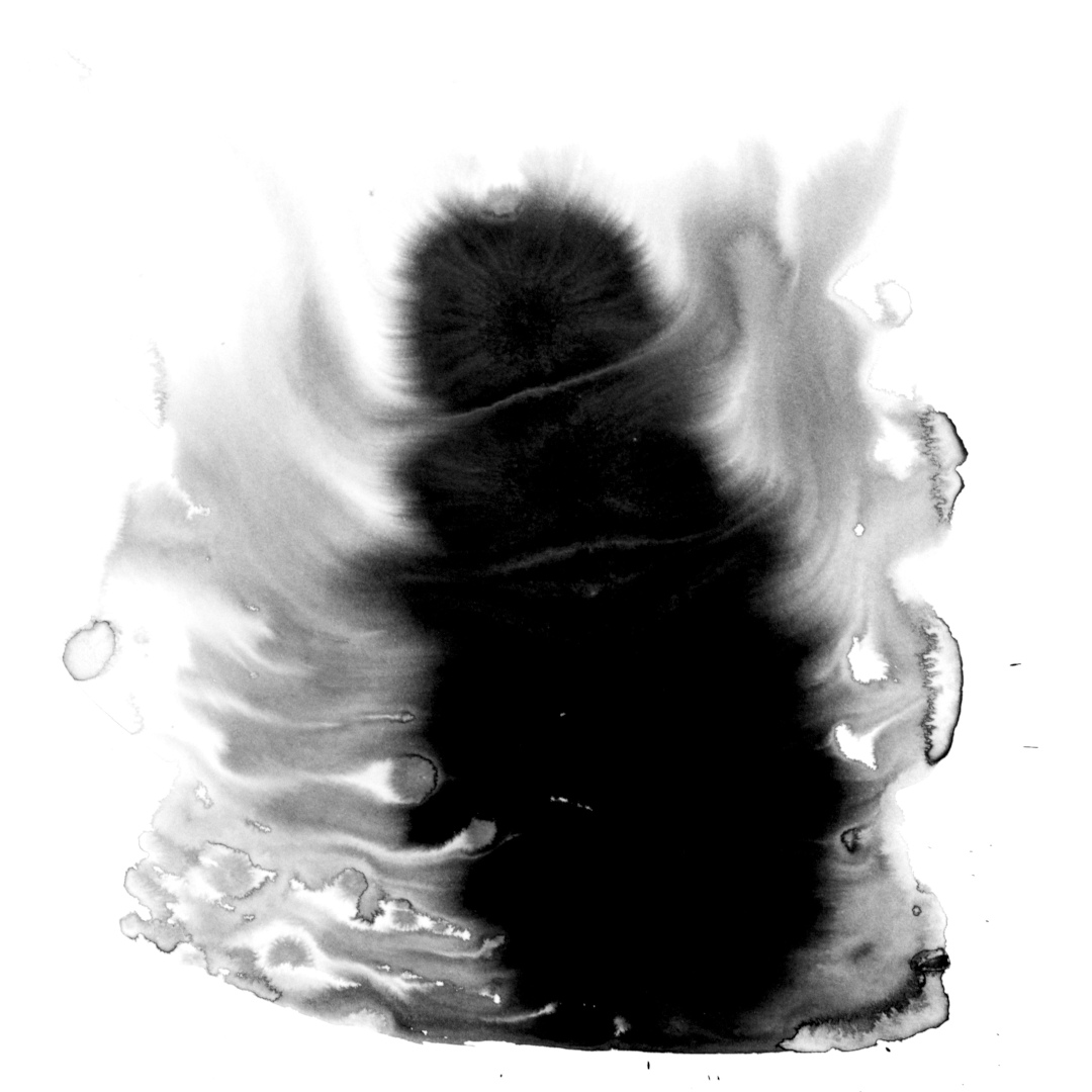
You can tell which way the paper was tilted here. The ink moved right, thinned out, broke into droplets at the edges. It recorded its own motion as it dried.
There's something genuinely enjoyable about making things this way - setting up a situation, stepping back, and seeing what the materials decide to do. The ink doesn't know it's supposed to be art. It's just following the water.